Adaptive Web Design (AWD)
Adaptive web design is a process of server-side detection that chooses a design layout and size to display. The adaptive design serves different versions of the site to different devices based on common screen sizes and resolutions, Adaptive web design (AWD) promotes the creation of multiple versions of a web page to better fit the user's device, as opposed to a single version that other web design techniques use. Adaptive web design encompasses a range of other strategies that can be combined with responsive web design. Adaptive web design uses multiple page layouts for a single web page and sometimes progressive enhancement (PE). The adaptive model is a "mobile separate" layout, in contrast to "mobile first", unobtrusive JavaScript, and progressive enhancement of RWD.[1]
Though definitions vary, adaptive web design is commonly understood to be the overarching design philosophy that incorporates both progressive enhancement and responsive web design. A website built according to ideal adaptive design principles will "adapt" to virtually any context in which it is viewed in order to deliver a useful, relevant experience to the user, regardless of the user’s browser, web device, or physical capabilities. This is not easily achieved, but it is the ideal many web developers are striving for as the state of the art moves beyond shortsighted programming towards more comprehensive, expansive design standards that account for a wider world of web access than previously assumed. Adaptive web design becomes easier to achieve with the advantages of HTML5 and CSS3. Responsive design’s media queries, for example, are only made possible with CSS3. HTML5 provides more semantic elements than previous iterations, allowing designers to more easily target content when designing sites. Its syntax and parsing rules are also designed to be largely compatible with older browsers, making graceful degradation fixes less frequently necessary. Our primers on HTML5 and CSS3 explain some of the stand-out features of the new standards, as well as provide further references for serious research.[2]
Why Use Adaptive Web Design (AWD)[3]
In this age of smart phones and tablets, users rarely use PCs and desktops to shop online. So if you have a normal website, you will need to have several websites for various devices such as smart phones, iPads and much more. Instead you can have one adaptive web design that will adapt to different user requirements based on different device capabilities. These websites are quite advanced in programming yet simple in operation. No matter what kind of device is being used, adaptive websites tend to deliver the best user experience to your target audience. There are tons of reasons why you should choose an adaptive design over a normal website design. Some of those are mentioned below:
- Single website for any device
- Consistent design and style
- Saves money
- Saves other resources
- Easy to maintain
- Helps in better SEO
- Better and wider reach
- Adapts to any device
- Lesser load on server
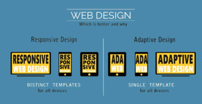
Responsive vs Adaptive Web Design[4]

source: Amarinfotech
- With RWD the layout is determined on the client-side because the same layout is to be used for all the screen-size while with AWD the layout is determined on the server-side as there are different layouts according to different device & OS.
- RWD is a one-size-fits-all type of the approach as the one you only need to design one layout for a single web page while AWD doesn't follow this approach because we have to design multiple version of layouts for a single web page.
- Responsive layouts are harder to make comparisons to Adaptive layouts as in Responsive layout you have to think about all the device and make one layout while in the Adaptive layout you have designed multiple layouts according to the device.
- Responsive Web Design offers you more flexibility in your website than Adaptive Web Design as RWD can work on any screen-size while AWD can only work on the designated screen-sizes, other than that will be a huge struggle.
- Responsive Web Design loads much faster than its counterpart in most cases as the responsive website only needs to load the single layout while adaptive websites need to load all the possible layouts which takes a while.
- Adaptive Web Design increases the complexity of your work or the project compare to Responsive Web Design as in AWD you have to create many layouts which are not the case in RWD.
- AWD requires a large team of developers for handling the complexity which increases the project budget while in case of RWD a small team is enough to design one single layout which will be useful in all scenarios.
- Responsive Web Design is more SEO friendly compared to the Adaptive Web Design. So if your client is interested in doing the SEO on his/her website in the future, you should use RWD, but if he/she is looking for a standalone app then AWD is a good choice.
- With AWD, The designer is able to optimize the advertisement on the website based on the data for the smart devices which is not the case with RWD where the advertisements get lost on the screen.
- AWD allows the designer to build the best possible UX for a particular device while in the case of RWD you can not build a specific design for a particular device.
See Also
Responsive Web Design (RWD)
Above the Fold
Below the Fold
Progressive Enhancement
User-Centered Evaluation (UCE)
References
- ↑ Definition - What is Adaptive Web Design (AWD)? Wikipedia
- ↑ Explaining Adaptive Web Design (AWD) OmniUpdate
- ↑ Why should you choose adaptive design? Ydeveloper
- ↑ Responsive vs Adaptive Web Design Amarinfotech
Further Reading
- Adaptive Web Design. Crafting Rich Experiences with. Progressive Enhancement Aaron Gustafson
- Adaptive Web Design and the Changing Mobile Environment Yotta
- A Guide to Building High Conversion Websites: Using Adaptive Web Design to Increase E-Commerce Sales & Lead Generation Click Laboratory
