Statistical Analysis
Statistical Analysis is the science of collecting, exploring, and presenting large amounts of data to discover underlying patterns and trends. Statistics are applied every day – in research, industry, and government – to become more scientific about decisions that need to be made. For example:
- Manufacturers use statistics to weave quality into beautiful fabrics, to bring life to the airline industry, and to help guitarists make beautiful music.
- Researchers keep children healthy by using statistics to analyze data from the production of viral vaccines, which ensures consistency and safety.
- Communication companies use statistics to optimize network resources, improve service and reduce customer churn by gaining greater insight into subscriber requirements.
- Government agencies around the world rely on statistics for a clear understanding of their countries, their businesses, and their people.[1]
Using Statistical Analysis[2]
Statistical Analysis may be used to:
- Summarize the data. For example, make a pie chart.
- Find key measures of location. For example, the mean tells you what the average (or “middling”) number is in a set of data.
- Calculate measures of spread: these tell you if your data is tightly clustered or more spread out. The standard deviation is one of the more commonly used measures of spread; it tells you how to spread out your data about the mean.
- Make future predictions based on past behavior. This is especially useful in retail, manufacturing, banking, sports, or for any organization where knowing future trends would be a benefit.
- Test an experiment’s hypothesis. Collecting data from an experiment only tells a story when you analyze the data. This part of statistical analysis is more formally called “Hypothesis Testing,” where the null hypothesis (the commonly accepted theory) is either proved or disproved.
Statistical Analysis - Example
Statistical Analysis is frequently used in business for company valuations and in many business decisions, such as stock holding and assessment. Stock volatility is one area where businesses frequently use this analysis to derive results. Businesses also analyze this data during risk management in order to assess the probability of a certain risk being incurred by a company and how substantial the risk may be. Companies also use regression formulas in order to test some of their more general hypotheses about the effect of a certain factor on their assets or the market price of the stock.
Let’s take a look at an example:
Johnny owns a social media company, FriendKeeper. Since its inception in 2005, the social media company has grown to unprecedented heights and is now a global force. However, recently Johnny has noticed that general membership on the website has declined in addition to new sign-ups. Johnny believes that one of the primary causes of this decline in numbers is the prevalence of news coverage by popular news sources on the ills of social media coverage. He decides to test this hypothesis. Johnny will thus take the following steps.
- Accumulate the quantitative data of the two variables in question.
- Put the data in a software program that can run some automatic statistical analyses.
- Run a linear regression.
- Analyze the r-coefficient and other relevant results.
- After the analysis of Pearson’s coefficient, Johnny will be able to determine whether the adverse news coverage on social media has had a negative impact on his membership.
Types of Statistical Analysis[3]
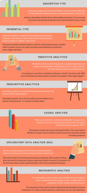
The two main types of statistical analysis are descriptive and inferential (see next section Descriptive Statistics Vs. Inferential Statistics). However, there are other types that also deal with many aspects of data including data collection, prediction, and planning.
- Predictive Analytics: If you want to make predictions about future events, predictive analysis is what you need. This analysis is based on current and historical facts. Predictive analytics uses statistical algorithms and machine learning techniques to define the likelihood of future results, behavior, and trends based on both new and historical data. Marketing, financial services, online services providers, and insurance companies are among the main users of predictive analytics. More and more businesses are starting to implement predictive analytics to increase competitive advantage and to minimize the risk associated with an unpredictable future. Predictive analytics can use a variety of techniques such as data mining, modeling, artificial intelligence, machine learning and etc. to make important predictions about the future.
- Prescriptive Analytics: Prescriptive analytics is a study that examines data to answer the question “What should be done?” It is a common area of business analysis dedicated to identifying the best movie or action for a specific situation. Prescriptive analytics aims to find the optimal recommendations for a decision-making process. It is all about providing advice. Prescriptive analytics is related to descriptive and predictive analytics. While descriptive analytics describes what has happened and predictive analytics helps to predict what might happen, prescriptive statistics aims to find the best options among available choices. Prescriptive analytics uses techniques such as simulation, graph analysis, business rules, algorithms, complex event processing, recommendation engines, and machine learning.
- Causal Analysis: When you want to understand and identify the reasons why things are as they are, causal analysis comes to help. This type of analysis answer the question “Why?” The business world is full of events that lead to failure. The causal seeks to identify the reasons why? It is better to find causes and treat them instead of treating symptoms. The causal analysis searches for the root cause – the basic reason why something happens. Causal analysis is a common practice in industries that address major disasters. However, it is becoming more popular in the business, especially in the IT field. For example, causal analysis is a common practice in quality assurance in the software industry. The goals of causal analysis:
- To identify key problem areas.
- To investigate and determine the root cause.
- To understand what happens to a given variable if you change another.
- Exploratory data analysis (EDA) is a complement to inferential statistics. It is used mostly by data scientists. EDA is an analysis approach that focuses on identifying general patterns in the data and finding previously unknown relationships. The purpose of exploratory data analysis is:
- Check mistakes or missing data.
- Discover new connections.
- Collect maximum insight into the data set.
- Check assumptions and hypotheses.
EDA alone should not be used for generalizing or predicting. EDA is used for taking a bird’s eye view of the data and trying to make some feeling or sense of it. Commonly, it is the first step in data analysis, performed before other formal statistical techniques.
- Mechanistic Analysis: Mechanistic Analysis is a not common type of statistical analysis. However, it is worth mentioning here because, in some industries such as big data analysis, it has an important role. The mechanistic analysis is about understanding the exact changes in given variables that lead to changes in other variables. However, the mechanism does not consider external influences. The assumption is that a given system is affected by the interaction of its own components. It is useful in those systems for which there are very clear definitions. Biological science, for example, can make use of.
Descriptive Statistics Vs. Inferential Statistics[4]
- Descriptive Statistics: Descriptive statistics is the term given to the analysis of data that helps describe, show or summarize data in a meaningful way such that, for example, patterns might emerge from the data. Descriptive statistics do not, however, allow us to make conclusions beyond the data we have analyzed or reach conclusions regarding any hypotheses we might have made. They are simply a way to describe our data. Descriptive statistics are very important because if we simply presented our raw data it would be hard to visualize what the data was showing, especially if there was a lot of it. Descriptive statistics, therefore, enables us to present the data in a more meaningful way, which allows a simpler interpretation of the data. For example, if we had the results of 100 pieces of students' coursework, we may be interested in the overall performance of those students. We would also be interested in the distribution or spread of the marks. Descriptive statistics allow us to do this. How to properly describe data through statistics and graphs is an important topic and discussed in other Laerd Statistics guides. Typically, there are two general types of statistics that are used to describe data:
- Measures of central tendency: these are ways of describing the central position of a frequency distribution for a group of data. In this case, the frequency distribution is simply the distribution and pattern of marks scored by the 100 students from the lowest to the highest. We can describe this central position using a number of statistics, including the mode, median, and mean. You can read about measures of a central tendency here.
- Measures of spread: these are ways of summarizing a group of data by describing how to spread out the scores. For example, the mean score of our 100 students maybe 65 out of 100. However, not all students will have scored 65 marks. Rather, their scores will be spread out. Some will be lower and others higher. Measures of spread help us to summarize how spread out these scores are. To describe this spread, a number of statistics are available to us, including the range, quartiles, absolute deviation, variance, and standard deviation.
When we use descriptive statistics it is useful to summarize our group of data using a combination of tabulated description (i.e., tables), graphical description (i.e., graphs and charts), and statistical commentary (i.e., a discussion of the results).
- Inferential Statistics: We have seen that descriptive statistics provide information about our immediate group of data. For example, we could calculate the mean and standard deviation of the exam marks for the 100 students and this could provide valuable information about this group of 100 students. Any group of data like this, which includes all the data you are interested in, is called a population. A population can be small or large, as long as it includes all the data you are interested in. For example, if you were only interested in the exam marks of 100 students, the 100 students would represent your population. Descriptive statistics are applied to populations, and the properties of populations, like the mean or standard deviation, are called parameters as they represent the whole population (i.e., everybody you are interested in). Often, however, you do not have access to the whole population you are interested in investigating, but only a limited number of data instead. For example, you might be interested in the exam marks of all students in the UK. It is not feasible to measure all exam marks of all students in the whole of the UK so you have to measure a smaller sample of students (e.g., 100 students), which is used to represent the larger population of all UK students. Properties of samples, such as the mean or standard deviation, are not called parameters, but statistics. Inferential statistics are techniques that allow us to use these samples to make generalizations about the populations from which the samples were drawn. It is, therefore, important that the sample accurately represents the population. The process of achieving this is called sampling (sampling strategies are discussed in detail here on our sister site). Inferential statistics arise out of the fact that sampling naturally incurs sampling error and thus a sample is not expected to perfectly represent the population. The methods of inferential statistics are:
- the estimation of parameter(s) and
- testing of statistical hypotheses.
Statistical Analysis - Techniques for Summarizing Data[5]
Some of the most common techniques for summarising your data, and explaining when you would use each one.
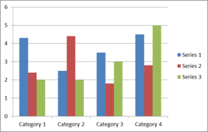
- Summarising Data: Grouping and Visualising: The first thing to do with any data is to summarise it, which means presenting it in a way that best tells the story. The starting point is usually to group the raw data into categories, and/or to visualize it. For example, if you think you may be interested in differences by age, the first thing to do is probably to group your data in age categories, perhaps ten- or five-year chunks. One of the most common techniques used for summarising is using graphs, particularly bar charts, which show every data point in order, or histograms, which are bar charts grouped into broader categories.
An example is shown below, which uses three sets of data, grouped into four categories. This might, for example, be men, women, and ‘no gender specified’, grouped by age categories 20–29, 30–39, 40–49, and 50–59.
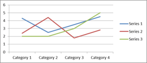
An alternative to a histogram is a line chart, which plots each data point and joins them up with a line. The same data as in the bar chart are displayed in a line graph below.
It is not hard to draw a histogram or a line graph by hand, as you may remember from school, but spreadsheets will draw one quickly and easily once you have input the data into a table, saving you any trouble. They will even walk you through the process.
The important thing about drawing a graph is that it gives you an immediate ‘picture’ of the data. This is important because it shows you straight away whether your data are grouped together, spread about, tending towards high or low values, or clustered around a central point. It will also show you whether you have any ‘outliers’, that is, very high or very low data values, which you may want to exclude from the analysis, or at least revisit to check that they are correct.
It is always worth drawing a graph before you start any further analysis, just to have a look at your data.
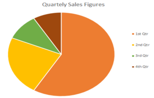
You can also display grouped data in a pie chart, such as the one below.
Pie charts are best used when you are interested in the relative size of each group, and what proportion of the total fits into each category, as they illustrate very clearly which groups are bigger.
- Measures of Location: Averages: The average gives you information about the size of the effect of whatever you are testing, in other words, whether it is large or small. There are three measures of average: mean, median, and mode. When most people say average, they are talking about the mean. It has the advantage that it uses all the data values obtained and can be used for further statistical analysis. However, it can be skewed by ‘outliers’, values that are atypically large or small. As a result, researchers sometimes use the median instead. This is the mid-point of all the data. The median is not skewed by extreme values, but it is harder to use for further statistical analysis. The mode is the most common value in a data set. It cannot be used for further statistical analysis. The values of mean, median, and mode are not the same, which is why it is really important to be clear about which ‘average’ you are talking about.
- Measures of Spread: Range, Variance, and Standard Deviation: Researchers often want to look at the spread of the data, that is, how widely the data are spread across the whole possible measurement scale. There are three measures that are often used for this:
- The range is the difference between the largest and smallest values. Researchers often quote the interquartile range, which is the range of the middle half of the data, from 25%, the lower quartile, up to 75%, the upper quartile, of the values (the median is the 50% value). To find the quartiles, use the same procedure as for the median, but take the quarter- and three-quarter-point instead of the mid-point.
- The standard deviation measures the average spread around the mean and therefore gives a sense of the ‘typical’ distance from the mean. To calculate the standard deviation, take the square root of the variance.
- The variance is the square of the standard deviation. They are calculated by:
- calculating the difference of each value from the mean;
- squaring each one (to eliminate any difference between those above and below the mean);
- summing the squared differences;
- dividing by the number of items minus one.
This gives the variance.
- Skew: The skew measures how symmetrical the data set is, or whether it has more high values or more low values. A sample with more low values is described as negatively skewed and a sample with high values as positively skewed. Generally speaking, the more skewed the sample, the less the mean, median, and mode will coincide.
- More Advanced Analysis: Once you have calculated some basic values of location, such as mean or median, spread, such as range and variance, and established the level of skew, you can move to more advanced statistical analysis, and start to look for patterns in the data.
Statistical Analysis - Pitfalls[6]
Using statistical analyses to produce findings for a study is the culmination of a long process. This process includes constructing the study design, selecting and measuring the variables, devising the sampling technique and sample size, cleaning the data, and determining the analysis methodology among numerous other issues. The overall quality of the results depends on the entire chain of events. A single weak link might produce unreliable results. The following list provides a small taste of potential problems and analytical errors that can affect a study.
- Biased samples: An incorrectly drawn sample can bias the conclusions from the start. For example, if a study uses human subjects, the subjects might be different from non-subjects in a way that affects the results. See Populations, Parameters, and Samples in Inferential Statistics.
- Overgeneralization: Findings from one population might not apply to another population. Unfortunately, it’s not necessarily clear what differentiates one population from another. Statistical inferences are always limited, and you must understand the limitations.
- Causality: How do you determine when X causes a change in Y? Statisticians need tight standards to assume causality whereas others accept causal relationships more easily. When A precedes B, and A is correlated with B, many mistakenly believe it is a causal connection! However, you’ll need to use an experimental design that includes random assignment to assume confidently that the results represent causality. Learn how to determine whether you’re observing causation or correlation!
- Incorrect analysis: Are you analyzing a multivariate study area with only one variable? Or, using an inadequate set of variables? Perhaps you’re assessing the mean when the median might be better? Or, did you fit a linear relationship to data that are nonlinear? You can use a wide range of analytical tools, but not all of them are correct for a specific situation.
- Violating the assumptions for an analysis: Most statistical analyses have assumptions. These assumptions often involve properties of the sample, variables, data, and model. Adding to the complexity, you can waive some assumptions under specific conditions—sometimes thanks to the central limit theorem. When you violate an important assumption, you risk producing misleading results.
- Data mining: Even when analysts do everything else correctly, they can produce falsely significant results by investigating a dataset for too long. When analysts conduct many tests, some will be statistically significant due to chance patterns in the data. Fastidious statisticians track the number of tests performed during a study and place the results in the proper context.
Numerous considerations must be correct to produce trustworthy conclusions. Unfortunately, there are many ways to mess up analyses and produce misleading results
Statistical Analysis Software[7]
Since not everyone is a mathematic genius who is able to easily compute the needed statistics on the mounds of data a company acquires, most organizations use some form of statistical analysis software. The software, which is offered by a number of providers, delivers the specific analysis an organization needs to better its business.
The software is able to quickly and easily generate charts and graphs when conducting descriptive statistics, while at the same time conducting the more sophisticated computations that are required when conducting inferential statistics.
Among some of the more popular statistical analysis software services are IBM's SPSS, SAS, Revolution Analytics' R, Minitab, and Stata.
See Also
Big Data
Predictive Analytics
Data Mining
Data Analysis
Data Analytics
Machine Learning]
Quantum Computing
Bayes' Theorem
Decision Tree
Tree Diagram
References
Further Reading
- Statistical Analysis Handbook
- Basic statistical tools in research and data analysis
- Statistical Methods of Analysis


