Difference between revisions of "Below the Fold"
m (The LinkTitles extension automatically added links to existing pages (https://github.com/bovender/LinkTitles).) |
m |
||
| Line 21: | Line 21: | ||
===See Also=== | ===See Also=== | ||
[[Above_the_Fold|Above the Fold]]<br /> | [[Above_the_Fold|Above the Fold]]<br /> | ||
| − | [[ | + | [[Responsive Web Design (RWD)]] |
Revision as of 18:45, 21 April 2023
Below the fold refers to the area of a web page that is only visible after scrolling. In web marketing, common wisdom dictates that content placed above the fold receives more viewer attention, so the space below the fold is less valuable. The concept of the fold is borrowed from print news journalism.[1]
A holdover from newspaper publishing, the term ‘below the fold’ was coined when there was an actual physical fold in the middle of the page. ‘Above the fold’ was anything on the top half, and ‘below the fold’ was anything underneath. The content that was deemed less important was traditionally placed below the fold, since it was mostly invisible when displayed on a newsstand. In the 1990’s as publishing moved onto the web, the term ‘below the fold’ remained. Still used in web design today, the term now refers to content located below the bottom of a browser window, or approximately 600 pixels from the top of the page.
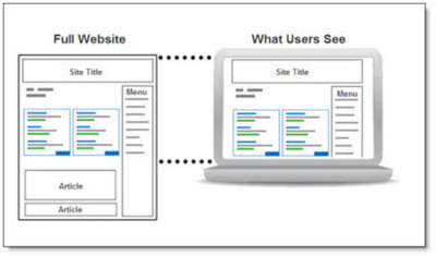
With below-the-fold placements, a user needs to scroll down the page to see an impression, displayed like in the figure below:

source: Performics
Why does 'Below the Fold' Matter?[2]
This matters because the content above the fold must be good enough to entice a reader to scroll. If the content above the fold is boring or not what the user is looking for, then they might leave the page. It only takes a few seconds on average for a user to decide if your website contains the content they’re looking for. Obviously, any inconsistencies in their expectations or misinformation will not make them scroll below the fold. The fold size varies between devices, mobile, desktop, or tablet, so what content is displayed will differ among devices.
How Is Below the Fold Measured?[3]
It is impossible to define an exact placement for the fold on a webpage, because its precise location can change according to screen resolution, as well as browser and screen sizes for thousands of phones, tablets and computer monitors. When determining an average fold placement, most web designers still agree that the fold line is at approximately 1,000 pixels wide and 600 pixels tall. This is the best-case scenario for the most common monitor/browser combination of 1024x786 pixels, with the browser window maximized and no installed toolbars at the top, pushing the content down. Your website’s audience analytics will indicate the most common screen dimensions for your site’s visitors.
See Also
Above the Fold
Responsive Web Design (RWD)
References
- ↑ What Does Below the Fold Mean? WordStream
- ↑ Why does Below the Fold Matter? Wishpond
- ↑ How Is Below the Fold Measured? Optimizely
Further Reading
- Designing below the fold Mustafa Kurtuldu
- Above the Fold vs. Below the Fold: Everyone Scrolls Alex Caldwell
- The Fold Manifesto: Why the Page Fold Still Matters Amy Schade
- Life Below 600PX Paddy Donnelly
